from brilliantdays.com by Oyvind Solstad
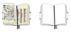
This is a book with many blank pages. A city guide book from Moleskine and there are 76 blank pages to be exact. 
I wish more books came with blank pages. More space for notes. Books like “Blink” and “Freakonomics” - books that triggers tons of ideas as I read them.
Maybe Moleskine could do some research: Which books would be popular with their biggest fans? Wouldn’t it be cool to have “Blink” with the Moleskine black binding, and lots of extra blank pages? Two extra blank pages after each big idea. Six extra pages after each chapter. And tabs included to mark those special pages. I would buy it. All my books are full of notes and drawings. Books are to be used.
The same to text books. Why not print text books with lot of blank spaces, in the margin, every alternate page...
But is it too late for publishers to realise how important annotation space is for learning? Because we are going digital!
But wait, how can we annotate any information we found?
I once have an implementation called ANN which allows authors to insert annotation points in their web pages. Anyone can annotate and see all the annotations. Unfortunately, the system disappeared after I left University of Melbourne.
SideNote is similar to my ANN.
Here is Facilitating the social annotation and commentary of web pages which provides more information about annotation implementations.


No comments:
Post a Comment